Kept & Counted

Learn to see it · the mechanics, one at a time

What a cap actually is.

On the coil page you learned to stop at the price and look underneath, at the volume. The cap is that look, named and measured. It is the single tell that splits a real coil from a trap, and once you can read it you can read most of the front page. Same as before: no jargon assumed, we build it up slowly.

First, just look

One bar towering over the rest.

Look at the volume panel under ACA again, the bottom strip. For months the bars are a low, even hum. Then, at the right edge, one bar towers over everything before it, many times the normal height, and it is bright green.

That tower is what we care about. Not the everyday hum, the tower. The part of that bar that pokes up above the normal line is the cap. It is the moment someone big made a decision and left a footprint you can see.
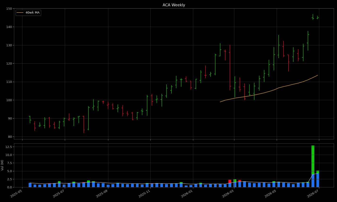
ACA weekly with a large green volume bar towering over the normal hum on the final week
ACA, weekly. Ignore the price for a second and just watch the bottom strip. The low even bars are normal turnout. That last green tower is the cap: effort far above normal, on a week that closed up.

What it actually measures

Volume is a headcount. The cap is who came that wasn't supposed to.

Volume is just how many shares changed hands. Think of it as attendance: how many people showed up to trade this stock this week. Every stock has a normal turnout, the crowd that always shows up. That everyday crowd tells you nothing. It is the same faces every week.

What tells you something is a week where the room is suddenly packed way past normal. A crowd that size does not gather by accident. It means a big player, the kind that moves size, made a decision and acted on it. The cap is exactly that overflow: the part of the turnout above what is normal for this name. Everything up to normal is noise and we throw it out. Only the overflow carries information.

And the overflow has a direction. If the week the room packed out closed up, the big money was buying, and we paint the cap green. If it closed down, the big money was selling, and the cap is red. That color is the whole game: it is who was actually in the room when it got crowded.

Hold this

A cap is the volume above a stock's own normal turnout. Green cap means big buying that week. Red cap means big selling. The everyday volume underneath is ignored entirely.

The tape measure

Normal is the stock's own 8-week average.

"Normal turnout" is not a guess. For each name, normal is its own 8-week volume average: what the last two months of weeks looked like. That line is drawn right across the volume panel (the pale line you can see running through the bars).

The part of any week's bar above that line is the cap. The part below is base volume, the everyday hum, and it is ignored. Green if the week closed up, red if it closed down. Here is the same idea as a clean schematic, so you know exactly what the machine is measuring:

Only three of those eight weeks left a cap at all. Most weeks are just the normal crowd, and the machine says nothing about them. The caps are the weeks that spoke.

Reading a run of them

You never get one cap. You get a tally.

A single week rarely settles anything. What matters is the run of caps across the whole pause: mostly green, or mostly red? That is the 6G / 0R notation on every card. Six weeks left green caps, zero left red. That is a lopsided vote for buying.

But a headcount alone can be fooled, so it is tallied two ways. Count is how many green weeks versus red. Magnitude is how much overflow each one carried, so that one enormous red week cannot hide behind three little green ones. Both have to agree before the machine will call it.

The commitment rule, in full

Accumulation: green overflow beats red by more than 15%, and green weeks are at least as many as red. Distribution: the mirror image. Anything else: neutral. The same arithmetic for every name, every run, no judgment calls.

Those three words are what you see on the read. Accumulation is big money buying the pause. Distribution is big money leaving it. Neutral is the machine refusing to pretend it sees a lean that is not there yet.

Why this is the tell

This is what made ACA and HLT split.

Remember the two coils. On price they were near twins: both tight, both pressed to the high. The caps are the only reason the read sent one to the pick list and the other to the fakes.

ACA Accumulation → cohering
ACA weekly: green caps dominating under a coil at the high

6G / 0R. A stack of green caps, no red. Big money is buying into the quiet. Structure said coil, the caps agreed, so the read calls it cohering and it earns a spot on the pick list.

HLT Distribution → diverging
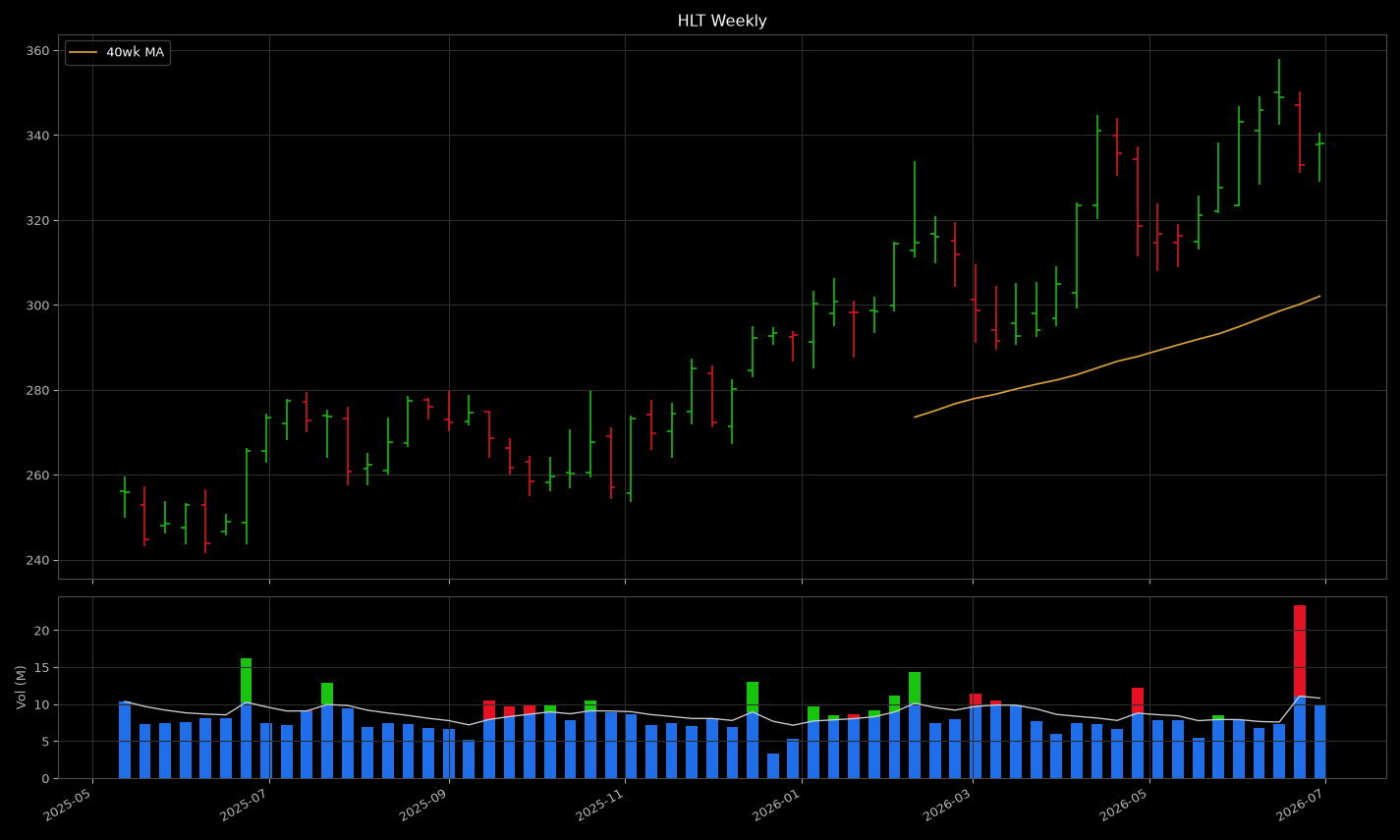
HLT weekly: a large red cap under a coil at the high

1G / 2R, and that red cap is a tower. Big money is leaving under a calm-looking price. Structure said coil, the caps said exit, so the read calls it diverging and puts it on the fakes list with equal billing.

That is the entire discipline in one line: the price draws the shape, the caps say who is behind it. Learn the cap and you have the tell the whole read is built to surface. The full geometry of the pause itself is on the coil page.

Now go read them yourself

Every card already shows you the tally.

Open today's read. That aG / bR on every name is no longer a code. It is the cap tally: a green weeks, b red weeks. Pick a name, read the number, then look at its volume panel and confirm it with your own eyes. Green towers where the number says green, red where it says red.

Do that on a handful and the number and the chart fuse into one thing. You stop reading "6G / 0R" and start seeing a stock being quietly bought. That is the point of all of this: not to be told, but to see it.

Every threshold here, printed in full with the reasoning behind it, lives on the how we count page. This page was the intuition. That page is the receipts.